Discipline
Project group management, architect, interior designer, responsible SØK
The new building joins the existing university facilities with a new main entrance oriented towards an atrium between the two existing wings. The building is adapted to the steep terrain, and it is connected with the respective floors in the existing building on all levels.
The new building is divided into a teaching wing and a laboratory wing, just like the existing building. In the teaching wing there are group rooms, seminar rooms, a reading room and microscope rooms. In addition to the faculty administration and offices for students and researchers, the laboratory wing contains various types of research laboratories, including the Centre for Forensic Genetics with special pressurized rooms. A Biobank has also been established in collaboration with the Tromsø University Hospital. In connection with the vestibule areas. there are auditoriums, break rooms/colloquium areas, cloakrooms, a coffee shop and a service square at the transition to the existing atrium. It has been an important premise that the new building and the existing building are to function as one facility upon completion.
The new building forms a monumental motif in Universitetsvegen, with a new entrance from the north side of the campus. A generous access square has been established, and the new entrance facade displays a large decorative project by artists Beret Aksnes and Vegar Moen.
Establishing sheltered outdoor spaces, primarily towards the southwest, has been emphasised. "The Students' Garden" on level 7 is sheltered against the wind while having good solar conditions. A terrace has been established on level 8 outside the new cafeteria, and there is a new walkway between the students' garden and Universitetsvegen.
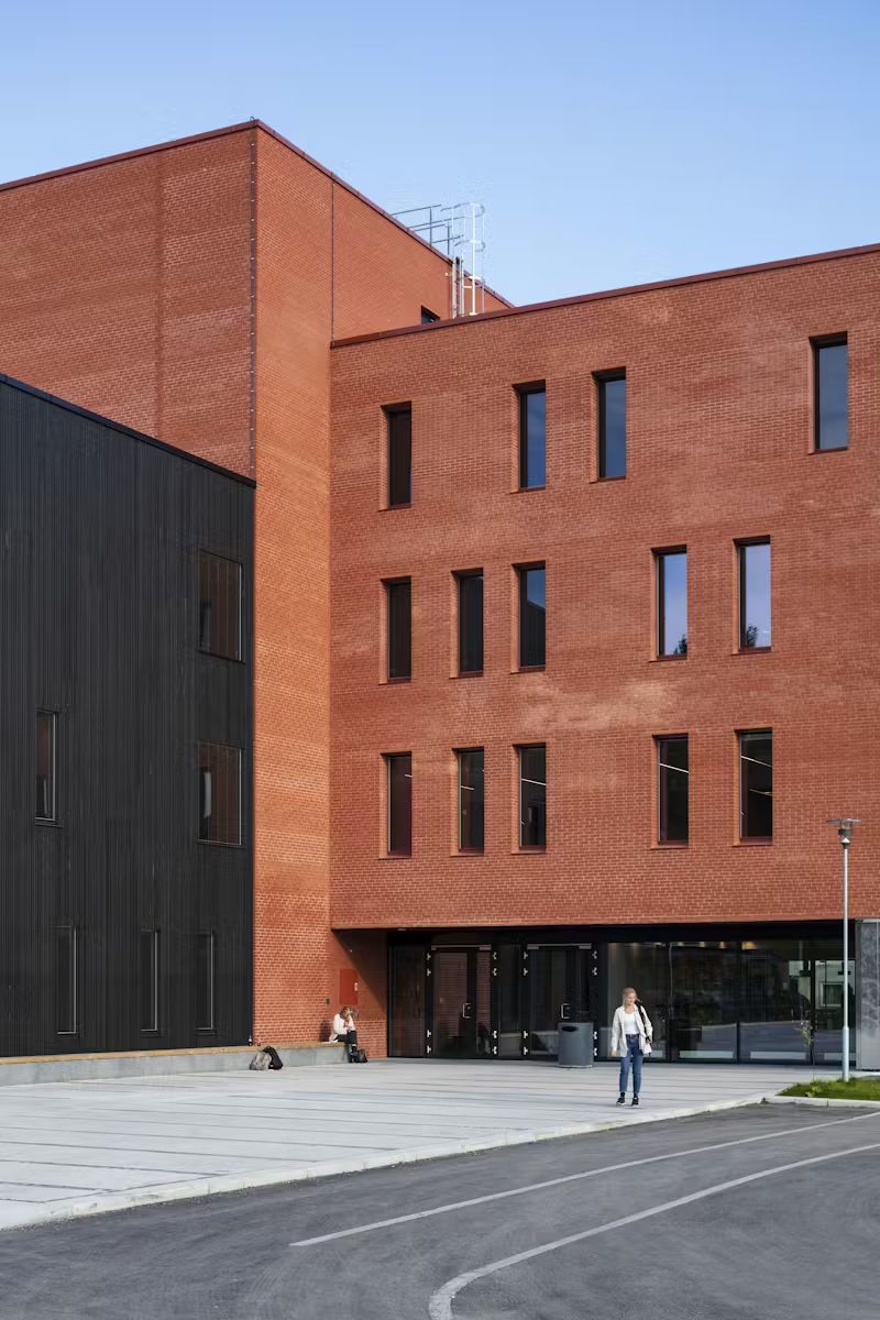
Like the existing building, the facade of the new building has brick as its main material. Brick is a prominent material at the University of Tromsø, and the choice of brick tiles is tied to the desire to belong to the red colour palette of the existing building stock. The new building and the existing building are to function together as one building, hey are to have material and expressive kinship, but also separate, distinctive identities. The adjacent lower volumes, towards the street and the students' garden, have wooden cladding and help downscale the total building volume.
Standard windows in the brick wall are placed in deep recesses, reinforcing the heavy mural expression. In the wooden facade, the windows are drawn far out into the facade in order to give the facades a very light expression. The tight and repetitive window placement og the brick facades are a contrast to the freer window placement in the wooden facades. The red and black colouring of the volumes is underlined by a consistent use of colours, such as red brick, red grooves, red window sills and red fittings, and similar for the black wooden facades. This makes the volumes simple, clear forms.
In order to reinforce the identity of the new building, the use of materials in the interior is attuned to the use of materials in the exterior. The interior also has extensive use of natural materials, where the colours are largely given by the original colour of the materials, with touches of stronger colours serving a guiding purpose in the building. The goal has been to use materials that are simple and solid, yet processed and refined.
Prominent materials are birch plywood and coloured MDF boards, the floor of the vestibule ground concrete with stone aggregates of stones from a local quarry. Concrete surfaces are exposed, and an important element of the colour palette. The concrete surfaces are rough, and together with the precise adjacent surfaces they have an important role in giving materiality to the building.
The building as a teaching institution is precise, objective and proper. At the same time, it has a roughness that frames the daily lie of the students. One has aimed at combining precision and roughness into a good interaction.


